

|

|
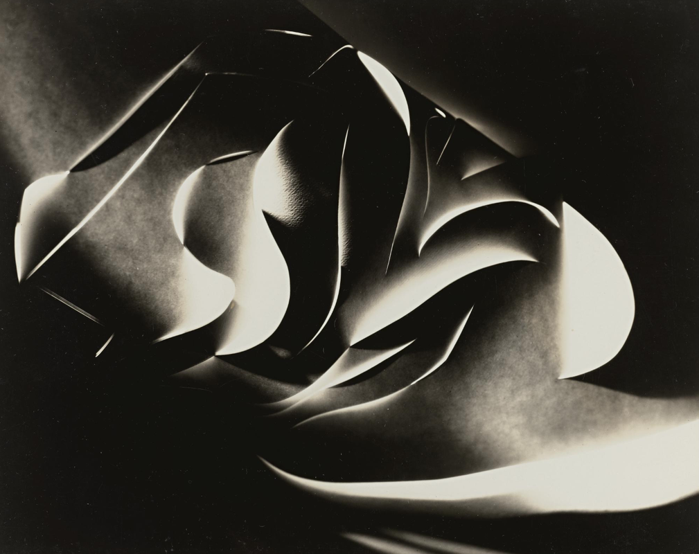
The images above are images made by two artists called Francis Bruguière and Jerry Reed. The one on the left is made by Francis Bruguière and the one on the right is made by Jerry Reed. The images are similar in some ways but also very different . For example the on on the left by Bruguière is an intricate design made with paper and what seems to be a scalpel. It has lines and curves etched into it allowing a certain amount of light to pass through and making the paper light up and and allowing you to see all of the curves and edges. The image on the right by Reed is less detailed but one that I personally prefer. It is made in the same way by using paper and a scalpel however the paper is cut into L type shapes and placed on a black sheet of paper which contrasts nicely with the White Ls. Light is not utilised as much in this image and is less complicated than the Bruguière image.
To make one of the images, you will need a scalpel or scissors, paper, a light and of course a camera. You will need to position the light or paper in a certain way if you would want to give it a certain effect. For example if you want to make the light shine downwards onto the paper or where you want to put each cut.
A portfolio of images


The bottom left image by Jerry Reed is part of his series of pictures called Paperwork. It was put together over a period of three years. Over this time he made 26 images . The image in the bottom left is the seventh image made for this series and was made in 2011.
I think that the things that are good about the image are the use of light and the way the paper is curved. The top of the paper curls are light and then the bottom is dark, along with the inside, which I think looks really good. I also like the curls because they are intricate and eye catching .
I think that the things that are good about the image are the use of light and the way the paper is curved. The top of the paper curls are light and then the bottom is dark, along with the inside, which I think looks really good. I also like the curls because they are intricate and eye catching .
Paper and Light


WWW: At the start of the task we weren't really sure about how to take pictures of 'edges' but after we got some help we started to get the hang of it and take some good pictures .
EBI: I think that we could have got a bit closer up to the paper to get more detail in our pictures which would have improved them.
EBI: I think that we could have got a bit closer up to the paper to get more detail in our pictures which would have improved them.
Noticing the light

In our last photography lesson we where given two images. We had to re-create them by drawing them, which we had mixed feelings about. Personally I didn't enjoy it. The top picture was reasonably easy to draw because it is not detailed and we had to shade pictures to get the different tones of colours. The picture on the bottom was really hard however. I had to closely look at the picture to see where all of the lines where then we began to draw. I began by doing the outlines of the different sections before beginning to shade.
I used the side of my pencil to shade as it was the easiest to get different tones as it seemed to be softer.
I used the side of my pencil to shade as it was the easiest to get different tones as it seemed to be softer.


Edges around the house


photo analysis

|
|
The two images above by Francis Bruguière and Vjego Sager are similar but also different in some ways. I think that they where made pretty much the same way . It looks as if they where both made by cutting lines into some plain paper . The picture by Francis Bruguière however is made up of more curvy lines compared to the straight , precise lines that make up the Sager image. The lines in the Sager image are also pushed in and out to give it a 3d effect. This could be the same in the Bruguière image however it is so dark you can't really see. It's hard to tell whet's gong on.
The lines are mostly curved in the Bruguière which means they look really intricate. The lines are mostly straight in the Sager picture.
If I had to choose some words to describe the pictures for the Bruguière picture I would use: moody, rhythmical and complicated and sharp edged, precise and architectural to describe the Sager image. I chose the words moody , rhythmical and complicated because the picture is dark it gives it a moody effect, rhythmical because of the curved lines and they also make It complicated. I chose sharp edged, precise and architectural because of how straight the lines are.
I prefer the Sager image because of how simple it is. I feel like the Brugiere image is over complicated.
20 minute exercise


For the start of this lesson we had 20 minutes to go outside and take at least 20 pictures looking down. When doing this exercise we had to think about things like framing, focus and colour. We used colour by finding things that interrupt the scene.
WWW: I think that I used colour colour effectively and made sure objects interrupt the background and are very random so make all of the pictures interesting.
EBI: I think that to make all of the pictures more interesting I could have thought about the framing more. For example I could have made the objects more centred and images with lines I could have made them run straight through the middle.
Paper Sculpture
Today we where given some paper strips to make a sculpture inspired by the artist/architect Frank Gehry. Once we had made our sculpture we had to take some pictures of it on different backgrounds to see how the edges changed.


I think that my sculpture came out quite well as it is quite detailed and looks quite nice. I could have filled the inside up bit more so there is more colour and less background. The blue background looks good as it allows the sculpture to pop out more than it would if it had a different background. Edges relates to these pictures as there are lots of different angles and shadows. I think overall it went reasonably well and the different backgrounds and the different angles of light allowed the edges to look very good. I feel like I could have taken more pictures though with different backgrounds to see the differences.,
Threshold concept cards
Our next project was to make a set of cards about the photography threshold concepts. These are how mine came out:


WWW: I think that all of the images that I chose where linked with each concept and I had some good description of each concept on the back.
EBI: I could have been more careful with the cutting them and made them the same size. I could have also taken better photos as the one on the left is cut off for some reason.
EBI: I could have been more careful with the cutting them and made them the same size. I could have also taken better photos as the one on the left is cut off for some reason.
