2020 has been an interesting year to say the least. Now that we are back in school after lockdown things have changed a great deal. We have new restrictions that have been put into place to keep us safe however this has impacted photography. Firstly, and probably the biggest change, is that we can't go outside and take photos whenever we want, get up and move around the room and use the schools cameras instead of just our phones. The months we have been at home and the global pandemic have shaped the future and world, for the better and for the worse.
However these restrictions could help us make different types of art that maybe we haven't thought about in the past. This could allow us to see and photograph things that we don't usually see/notice/pay attention to. We also might have more time to look and criticise our work and improve.
Artists are good at solving problems because they embrace mistakes and incorporate them into their work. For example someone could smudge a bit of paint but turn it into something to improve their work.
When I look at the phrase 'Make Do & Mend', it makes me think of embracing difficulties and changes. If something bad happens to you that you can't change, you make do with it, take the problem on and mend it - don't let it bother you.
My Instructions
Take a photo high up
Take a photo low down
Take a photo of something that scares you
Take a photo of the sky
Take a photo of the sunset/sunrise
Take a photo at night
Take a photo at a confusing and interesting angle
Take a photo at lunch and break
Take a photo of someone doing something you enjoy
Take a photo once every hour
Take a photo at a precarious position
My instructed photo task
We had instructions to take photos of the contents of our bags and then rearrange the objects, this is how mine came out...


Marcel Duchamp and the readymade.
The Mona Lisa is arguably the most famous painting in the world. It was painted by an Italian artist called Leonardo da Vinci in 1503. It first became famous after a man who worked at the Louvre Museum named Vincenzo Peruggia stole it in 1911. Vincenzo kept it in his apartment in Italy for two years, however he grew impatient to sell it and contacted an art gallery owner who informed the police . After this the painting grew even more famous and is currently worth over £800 million.

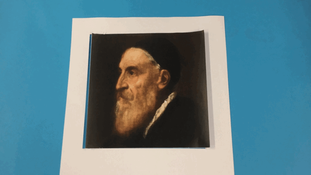
Marcel Duchamp was a French painter and sculptor who made interesting but controversial changes to different every day items and famous paintings that some people found shocking. We have been studying a specific piece called L.H.O.O.Q in which he drew a moustache and beard on the Mona Lisa.
Obviously he couldn't draw/deface the original painting so he found a postcard size version and drew on that. The image he created was quite unique at the time because of the fact that many people didn't see it as a valid art form. They saw it as vandalising and ruining 'real art'. Some people also saw it as protesting against traditional art.
Obviously he couldn't draw/deface the original painting so he found a postcard size version and drew on that. The image he created was quite unique at the time because of the fact that many people didn't see it as a valid art form. They saw it as vandalising and ruining 'real art'. Some people also saw it as protesting against traditional art.

1). Marcel Duchamp’s picture ‘L.H.O.O.Q.’ (1919) uses a postcard reproduction of Leonardo da Vinci’s ‘Mona Lisa’ (1503-17). Describe Leonardo’s painting and explain why it is so famous.
Leonardo Da Vinci created a painting named the Mona Lisa and although it has been relatively famous since its creation, most of it's fame came when it was stolen in 1911. It was stolen from the Louvre Museum in France by an Italian man named Vincenzo Peruggia. He was a handyman at the museum at the time and after the theft went back to Italy and kept the painting in his flat. He soon grew impatient and contacted the owner of a local art gallery to see if he wanted to buy it. The gallery owner informed the authorities and he was soon arrested
2). Now describe Duchamp’s ‘L.H.O.O.Q.’ What has he done to the reproduction of Leonardo’s painting? What does the title mean? Why might he have added male facial hair to the female portrait?
Duchamp added a beard and moustache to a postcard size version of the Mona Lisa. He could have added this to throw a “curve ball”/attack modern art and challenge the current thoughts about art.
3)What do you understand by the term ‘readymade’? In what ways is ‘L.H.O.O.Q.’ a readymade?
The ' readymade' was a term created my Duchamp to describe the art he made. It means to get something that already exists and change it/ adapt it to make it your own. L.H.O.O.Q is a 'readymade' because Duchamp got a postcard sized print of the Mona Lisa and adapted it and changed it to make it his own new piece of art.
4)Why was Marcel Duchamp’s idea of the ‘readymade’ such a revolutionary idea in art?
People saw it as copying and unoriginal. Because it was an attack on the modern day form of art, people saw Duchamp as a rebel and only some accepted this art form.1). Marcel Duchamp’s picture ‘L.H.O.O.Q.’ (1919) uses a postcard reproduction of Leonardo da Vinci’s ‘Mona Lisa’ (1503-17). Describe Leonardo’s painting and explain why it is so famous.
My response
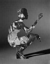
We have been making pieces of art inspired by the artist Marcel Duchamp and his piece L.H.O.O.Q. This piece was Mona Lisa with a beard and moustache.
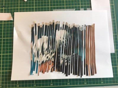
I experimented with manipulating an image that I was given to try and echo the different processes used by Marcel Duchamp and other artists at the time.
My idea was to cut up the picture I was given into strips and rearrange them but make sure the base image was still visible.
The first step was to cut the image into strips, which was probably the easiest part. I had to do was use a ruler and cut uniform , vertical lines . Although it mostly went well, towards the end the lines went a bit wonky but it looked fine and didn't spoil the effect I wanted.


The last and probably most tedious part, was gluing everything down onto the paper. I decided to give the final product a wave type effect by sticking some strips higher than others, which I'm still not sure was an improvement. It sort of works but I feel like leaving the strips in their original positions probably would have been better as changing them distorted the image too much. This is the final product:
WWW: I feel as if I understand this type of art better now and that my piece is interesting and looks good . Overall I think I did a decent job.
EBI: I feel like I should have put the strips closer together and made them more even. When doing the cutting the scalpel slipped a couple of times so some of the strips I couldn't repair or use . This would have made it much easier to see the effect I was trying to get.
EBI: I feel like I should have put the strips closer together and made them more even. When doing the cutting the scalpel slipped a couple of times so some of the strips I couldn't repair or use . This would have made it much easier to see the effect I was trying to get.
Kensuke Koike's animations.
Kensuke Koike is a 40 year old Japanese visual artist who currently works in London. His work consists of cutting and manipulating photographs he has found to change them into a new image.
Inspired by Kensuke Koike's work we made our own, using the same original photographs he used. We had to cut up an image and re-arrange it like we did last week however, make an animation about making it/ how it went. To do my animation I used an app called Stop Motion which allows you to take the images and then the app automatically puts the images in order to create a stop motion animation. It was slower than below when I was making it but because it saved as a gif it sped the animation up. This is how It came out...
WWW: I'm very pleased with how the animation came out and I think it documents the process of how I did the task well.
EBI: I think it definitely looked better slower as it was easier to follow and looked less rushed. I spent lots of time on it so I would rather it didn't look quite so 'scrappy' but because I had to upload it as a gif there was not much I could do about it.
EBI: I think it definitely looked better slower as it was easier to follow and looked less rushed. I spent lots of time on it so I would rather it didn't look quite so 'scrappy' but because I had to upload it as a gif there was not much I could do about it.
Deborah Roberts response
Deborah Roberts is a fascinating artist who makes collages out of multiple pictures. We where given 2 pictures and had to cut them up and create our own collages inspired by her. It was difficult towards the end as I had used all of the most useful parts of the starting image we were given. This is how it went...

Deborah Roberts is an artist who makes collages using different sources like photos and magazines. She takes sections of these images and turns them into something new and striking. In most of her images she represents identity in various ways, for example African beauty.

|

|
Personally I think that my image is quite good. It is a good collage and looks interesting.
WWW: I think that I understood the task well and did a good job overall.
EBI: I think I could have added more to the background so there was not so much white space and also so the dress was not bigger than the background.
WWW: I think that I understood the task well and did a good job overall.
EBI: I think I could have added more to the background so there was not so much white space and also so the dress was not bigger than the background.
Notes from the Street
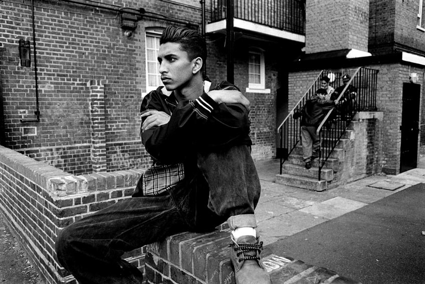
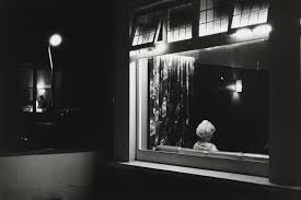
Notes from the Street by Anthony Lam is a collection of 20 photographs all taken in black and white of people on the street. I was given this image which is a part of this collection and had to speak about it.
In the foreground of this image there is a man who looks to be about 18-20 sitting on a brick wall surrounding an estate. In the mid ground there is nothing except for the pavement and some tarmac, which splits the image in half. In the background there is a small set of 7 stairs with another 3 teenagers sitting down. As well as this there is a what seems to be a bin chamber, some windows and a low down balcony.
My initial response was ,why is the boy (the subject of the image) sitting so far away from everyone else - is he looking out for someone? I think the image is representing different cultures in society and what it was like to be a teenager at the time the image was taken, which I think is 1995-2005. If I had the chance, I would ask him why he is sitting away from everyone. I don't know why but for some reason it really intrigues and makes me wonder. I think that the artist was trying to convey different cultures in Britain because at the time the photograph was taken race would have probably been looked upon quite differently.
I think it speaks about the different conditions, different people lived in at the time and what the conditions and outdoor spaces were like. The aesthetic of the image helps enhance the message because the image is about 'the streets of England'. The black and white along with the setting, really mirrors this and therefore enhances the effect. The photo does remind me of some other photos I have seen that speak about race and inequality which is the kind of effect that I get from looking at this picture. If I had to give this image a title I would call it 'Watching'. This is because it looks like the guy is watching something that is far off in the distance.
Next we had to create our response. We had to cut up 2 images of our choice and create something new. We did this by layering the 2 images together. I used the one above and one more . The use of two images gave it a peculiar look in my opinion which I created by cutting holes in different parts of the image.
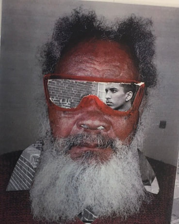
WWW: I think that the layering effect works well and looks good because the main image of the old man, which is in colour, and then the black and white image contrast well.
EBI: I think that my cutting was quite rough so in places there are dots of white paper which sort of ruin the layering effect because you can tell they are two separate images.
EBI: I think that my cutting was quite rough so in places there are dots of white paper which sort of ruin the layering effect because you can tell they are two separate images.
Hannah Hoch
Hannah Hoch was a German artist born in November 1889 and died in may 1978 . She was part of the art movement called Dada which included artists who rejected the style and aesthetic of modern art. Hannah Hoch manipulated, changed and combined images to create something new and intriguing.
|

|
We made collages inspired by Hannah Hoch and the Dada movement. We did this by cutting images out of a magazine and combining them to create inspired collages.


The first picture was my first attempt. I think it went well but it didn't really echo the Dada movement and wasn't "wild" enough. The second was much better in my opinion as it was more like Hannah Hoch's work with the body parts cut away from the face.
WWW: They both look similar Dada images and look interesting.
EBI: I could have added more to the background like Hannah Hoch did in many of her pieces.
WWW: They both look similar Dada images and look interesting.
EBI: I could have added more to the background like Hannah Hoch did in many of her pieces.
Amanda Durepos
Amanda Durepos is a Canadian collage artist. She went to Concordia University and graduated with a BFA. She mainly experiments with collage but also multimedia. Here are some examples of her work:


I decided to respond to Amanda Durepo's work by using various overlapping images which is what it looked like she did.


WWW: I think that they both look like something Amada Durepos would make.
EBI: I think I could have made the cuts in the square more precise and straight.
EBI: I think I could have made the cuts in the square more precise and straight.
Maurizio Anzeri
Maurizio Anzeri is an Italian artist born in Loano Italy in 1969. He makes images by threading string through paper creating a mesmerizing effect.

I responded to Maurizio Anzeri's work using thread and a needle trying to mimic his techniques. This was quite tricky and I did poke myself a couple of times but I think it was a fun task and allowed me to try out a new process that I hadn’t thought about before.
WWW: I think that it looks really interesting
EBI: I think that it would look much better if I used a thinner thread and stretched it more so that it didn't look loose. I also think that it looks a bit cluttered so removing some thread could make it better.
EBI: I think that it would look much better if I used a thinner thread and stretched it more so that it didn't look loose. I also think that it looks a bit cluttered so removing some thread could make it better.
Matt Lipps
Matt Lipps is an American artist who works and lives in LA. He creates work by cutting out people or things from magazines. He will come up with a theme for example 'people' then go through magazines cutting out various images.
We responded to Matt Lipp's art using the same technique he uses.
|
To make this image I went through a magazine and cut out images of different people and a bird which I thought looked good and had potential and then cut out some scenery. I stuck the scenery onto the back of the pictures then stuck them onto some black card.
WWW: I think that my image looks good and quite like some of Matt Lipp's work. EBI: I think I could have added more images to fill up the blank background which would have added some more life to the image. |

|
Daniel Gordon
Daniel Gordon is an American artist from New York, USA. He makes work using cut outs from various magazines. In his work I can see different cut outs from paper that make up a distorted face. Daniel has used 2 different coloured hair styles, blue and ginger, to make up the hair and cut out various pictures to form the shape of a face. I think that this image was made by finding multiple magazines and cutting out pictures. Then I think the artist drew the rough shape that he needed onto the part of magazine he cut out then using a scalpel get rid of all the extra bits leaving the final shape. The artist has used various skills. He has used cutting skills , imagination, attention to detail, creativity and improvising for things that don't always go as planned. Three words I would use to describe the work are:
-bizarre
-eye catching
-warped
Three questions that I would ask the artist are :
-What was your inspiration for this piece?
-What methods would you recommend for someone wanting to create a piece like this?
-How exactly did you make this piece?
-bizarre
-eye catching
-warped
Three questions that I would ask the artist are :
-What was your inspiration for this piece?
-What methods would you recommend for someone wanting to create a piece like this?
-How exactly did you make this piece?
Abigail Hunt
Abigail Hunt is a British artist who lived and works in London.

She makes art with different bits of paper and various other cut-outs and arranges them in a certain way. Personally I really like this art style as it is quite simplistic but looks really good and interesting. It looks to me as if it was made using scissors and scalpels to create the precise cuts and circles. I responded to her work using some of the techniques that it looked like she used in my opinion.

WWW: I think that my response looks good and definitely reminds me of Abigail's work.
EBI: I think the lighting could have been better and I could have used a bigger bit of paper and used more shapes.
EBI: I think the lighting could have been better and I could have used a bigger bit of paper and used more shapes.
Prison photography
I think that prison photography is interesting because it is unique and because the people have limited resources, it could give us a glimpse into their minds and what life is like for them. It also shows that people in that certain prison do care about their life after their sentence and their rehabilitation. Right now during the covid-19 pandemic, being shut up at home is somewhat reminiscent of life in prison, we are all suddenly shut up inside with not much ability to do things. We can't go outside to see our friends and only to exercise and get food. In prison people only go outside to exercise. I think that photography is used in prison to give inmates something to do and another outlet other than crime. Also when they leave prison it gives them something to do. It might be difficult to practice photography in a prison setting due to the fact that it is quite a bare place, there is not much green and its all grey and made of concrete. It could also be hard because prisons are sometimes very violent places so it could be very difficult to find a quiet place.
Nicolò Digiorgis
Nicolò Digiorgis book "prison photography" is a book that is a collection of photos made by inmates of Bolzano-Bozen prison over a six year photography workshop.
Nicolò Digiorgis
Nicolò Digiorgis book "prison photography" is a book that is a collection of photos made by inmates of Bolzano-Bozen prison over a six year photography workshop.
Photography genres


1) architecture
2) portrait
3) still life
4) fine art
5) landscape
6) nature
7) travel
2) portrait
3) still life
4) fine art
5) landscape
6) nature
7) travel
We created responses to the genres above by taking one picture with as many genres in as possible. This is how mine came out:
Next we came up with some rules and restraints as well as what pictures we had to take.
Up close and personal


These photographers could want to take close up photos to explore angles that people do not usually think to take pictures from. Photographers usually take photos with a normal perspective however these photographers thought to take close up images of the world. They might want to explore the world from a new point of view.
We created a few responses to the theme "up close and personal" and these are mine:


I found this quite fun as I don't normally think about taking close up images so I liked experimenting with different objects and angles to create somewhat distorted images that you can not immediately see/make out what they are.
Collection of genres
Our task today was to create an image that had as many photography genres in it as possible. It was quite hard to find items that were all different genres so that part probably took the longest. Once I had found my items I had to begin placing them in different places so that you can see them all and most of all so it looks interesting. My first attempt was ok however it could have been better. All of the objects were placed at the same height and it didn't look very good in my opinion.
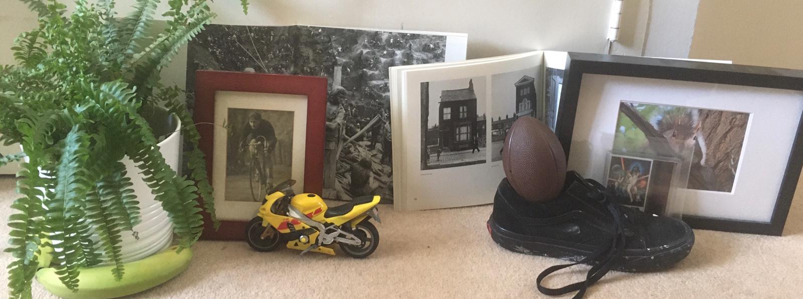
You were able to see what the genres were however some of the objects I chose were not very visible. Based on the feedback I received I remade my image.
Overall I think that my second attempt went quite well. I made sure to use different levels and also made sure all of my objects were clearly visible and my image was definitely better. I also decided to use shadows as that made my image more interesting and added more focal points.

WWW: I definitely think that the shadow on the wall makes the image much better and I really improved when it comes to positioning.
EBI: I think I could have possibly made the objects a bit closer together as some of them were cut off because of my phone camera but I feel like this could have made everything seem squashed.
EBI: I think I could have possibly made the objects a bit closer together as some of them were cut off because of my phone camera but I feel like this could have made everything seem squashed.
Sculpture
Today we created sculptures using everyday household items. I chose to make my sculpture out of an old coat hanger I found when looking for materials. I thought this would be good to use because it could be bent easily into different shapes.


Using different lighting and positioning I created multiple pictures of my sculpture and then put them into Photoshop to edit them. I decided to create two edits in Photoshop, one using the different lenses you can choose and one using the different functions of the app and no lenses. I liked the image with the lens effect the most as there is more going on and it is much more appealing. I think that the second picture was good but it was only black and white so it was quite boring and you see those colour schemes a lot. I continued to edit my other pictures using filters, lenses and other editing features of the app.
Instructions for experimenting with a "found" photograph.
1) Hold the photo in one hand and photograph it with the other.
2) Take a photograph of your finger pointing at something in the photograph.
3) Take a photograph of your photograph with light reflected on the surface.
4) Take a super close up photograph of your photograph.
5) Photograph your photo in an unusual location
6) Photograph your photo inside a book
7) Photograph your photograph peeking from someones clothing.
8) Put the photo under a chair leg and photograph it.
9) Cover the photo so only a small part is visible and photograph it.
10) Ask someone to hold a photograph in front of their face and photograph it.
11) Write a message on the back of a photograph and photograph it.
12) Photocopy and enlarge your photo by 300%
13) Photograph the photo on top of the copy.
14) Make a paper airplane from the photocopy and throw it. Take a picture where it lands.
15) Scrunch the photocopy into a ball (image on the outside). Photograph it.
16) Submerge the photograph in water. Photograph.
17) Tear the photo in half place two untorn edges next to one another and take a photo.
18) Tear the two half's in half again place the straight edges next to each other and make a photograph.
19) Place one piece of the torn up image in your palm and photograph it .
20) Throw all 4 pieces into the air and photograph them where they land.


I think that all of my images were good and I followed the steps well. However something I was thinking about was how from step 16 onward where it doesn't specifically tell you to use the photocopy anyway I still used it.
Photo collage

Google Maps safari
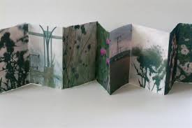
Inspired by the Agoraphobic Traveller, an artist from New Zealand who takes images and creates projects using google maps, we also travelled around the world photographing/screen-shotting different


In this project I went to Venice in Italy. It is somewhere I have always wanted to go however I have never had the opportunity. I think that this project was really enjoyable and a way to see these different places from new close up angles.
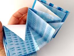
The first step was to photocopy a map specifically the area we live in. Next, using the printer, we had to paste our screenshots over pages with the map and then fold it into a book. It was very tricky trying to get even folds when creating my book. We also had to stitch a seam into the side of the book to ensure the pages were held together.
The first step was to photocopy a map specifically the area we live in. Next, using the printer, we had to paste our screenshots over pages with the map and then fold it into a book. It was very tricky trying to get even folds when creating my book. We also had to stitch a seam into the side of the book to ensure the pages were held together.
Developing my own personal response
I will be focusing on street view photography and I will take inspiration from artists like Amanda Durepos and Pierre Roy. I really like their work and I think that and it will be fun to experiment with similar processes to these artists. I decided I will make my responses by taking screenshots of various images on google maps. I will take screenshots of landscapes as well as screenshots of interesting things that I find. I will then combine them to make my own responses. I also think that taking screenshots at different times during the day could give my work a nice touch and give it a mysterious effect. My theme is going to be nature and city life. Personally I find it really interesting looking at the completely different versions of life in different places in the world. For example, places like Tokyo that are full of life and colour compared to places like Antarctica that are full of life but not the same sort. I think these two themes would look really good if I put them together to create surrealism responses as they contrast very well.
First I needed to go onto google maps and find various images to use in my collage.


These two first images appealed to me because they are both interesting and I think they would look good if they were experimented with. For example change the sky.


I collected a total of 12 images. 6 for wildlife and 6 for city life. I will begin to combine the photos to make my Amanda Durepos and Pierre Roy response. So far I think I have found some very interesting pictures
Comparing my two artists work
Amanda Durepos and Pierre Roy both make similar work. They both create pieces that come under the genre surrealism. I personally really like this genre as it is very interesting and pleasing to the eye. I prefer Pierre Roy's work as it is much more vibrant and there is much more going on than in Amanda Durepos work, however I think if I combine the two it will create something even better. In both images the main subject is centred, in Pierre Roy's work it is the man with the woman's face. Both images are very weird and make you wonder what is happening in the images. In Pierre Roy's work there are men with different coloured heads with a sunset background and a strange object. I think that the terrain and background look like another planet. I'm not sure what it is and why one of the characters is falling off. In Amanda Duerpos's image, there is a man in what seems to be a cave. The texture of the roof makes it look strange and makes me wonder what and where it is.


My next steps are to use a cutting mat and scalpel to mix and match the different images
First I chose which photo I wanted as my subject and began to cut out the various parts I wanted to replace. I removed the blue sky that was leftover however I couldn't remove all the blue without ruining the picture. My next step was to choose the background. I went through all of my images to choose my favourite background and then kept on narrowing it down until if found the best matching one. I chose a city skyline. I finally put them together and then flipped the background so the buildings were upside down and I think this really mirrors the mystery and surrealism.
First I chose which photo I wanted as my subject and began to cut out the various parts I wanted to replace. I removed the blue sky that was leftover however I couldn't remove all the blue without ruining the picture. My next step was to choose the background. I went through all of my images to choose my favourite background and then kept on narrowing it down until if found the best matching one. I chose a city skyline. I finally put them together and then flipped the background so the buildings were upside down and I think this really mirrors the mystery and surrealism.


WWW: I think that my work mirrors my two chosen artists really well and creates a sense of mystery. It has a dystopian feel to it.
EBI: I was thinking I should have printed off the images larger than A4 but I think the smaller A4 looks good.
EBI: I was thinking I should have printed off the images larger than A4 but I think the smaller A4 looks good.
Found photograph collage
Today we were given various found images and experimented with arranging them into various collages by ripping them and disfiguring them.


Once I had ripped them I began to experiment by arranging them in different positions putting things like heads on different bodies. One thing that I did struggle with was trying to fill all of the empty white space as some of the images were too small


I think my collage looks really good overall and the bits of white paper that were left over improver the overall look of the image. Finally I decided to experiment with photocopying the image onto itself using various different colours available on the printer. I Think that this layered effect added depth to the overall image and improved it.
